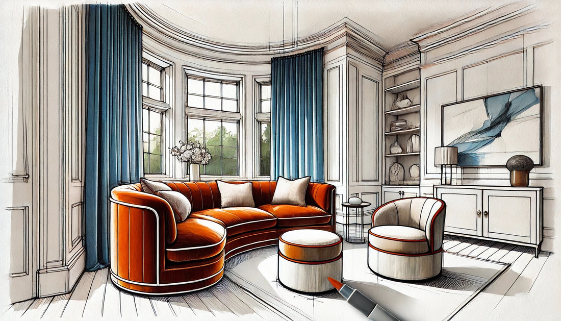
Today, I had an interesting experience while working in our furniture showroom. A designer came in with a couple who were in the process of furnishing their new home. Together, they selected some truly stunning pieces: two beautiful sofas with rounded corners in a rich burnt orange velvet, accented by off-white contrast piping. To complement them, they chose two occasional chairs in a textured ivory boucle with the same burnt orange contrast piping. The combination was a perfect blend of warmth and texture, sure to create a cozy and inviting space.
But then something happened that caught my attention. As we were discussing the final details, the woman, who clearly had a strong vision for her new home, mentioned that she had fallen in love with a set of marine blue curtains. She was eager to use them in the space, her excitement palpable. However, her designer quickly dismissed the idea, claiming that the colors would clash.
Here’s the thing: this simply isn’t true. Burnt orange and marine blue are complementary colors, meaning they naturally enhance each other. Whether bold and bright or soft and muted, complementary colors create a balance that can bring a room to life. They offer contrast while maintaining harmony, giving a space depth and personality.
As much as I wanted to say something, it wasn’t my place to intervene. In that moment, my role was as a sales assistant, not the designer. But the situation left me reflecting on a larger issue: how often do designers miss opportunities to create outstanding projects simply because they shy away from color?
It’s no secret that many people gravitate toward neutral tones when designing their spaces. Neutrals are safe. They’re elegant. And yes, they almost always “work.” But when clients express a desire for color—especially when they’ve fallen in love with a specific hue—shouldn’t we, as designers, embrace that chance to create something unique and memorable?
I found myself wondering: how many designers truly understand color theory? It’s not enough to know that neutral works—great design comes from understanding why things work, and how to push the boundaries in a way that elevates a client’s vision. Color theory is fundamental, and it’s something all designers, regardless of formal education, should take the time to explore. There’s a wealth of knowledge available, and the information is literally at our fingertips.
As designers and architects, our primary responsibility is to guide clients toward the best version of their vision—not to impose our own limitations on their creativity. It’s our job to harness that excitement they feel when they find something they love, and to integrate it into a cohesive, stunning design. Sometimes, that means stepping outside of the comfort zone of neutrals and into the vibrant world of color.
So, to my fellow designers: the next time a client expresses a desire for a bold hue, don’t dismiss it. Use it as an opportunity to create something truly outstanding. After all, our goal isn’t just to create spaces that are “nice”—it’s to create spaces that our clients love. And sometimes, that means embracing a little color.

